BRAND IDENTITY | BRAND STRATEGY | WEBSITE DESIGN
Branding and Web Design for a Parenting Coach
THE CLIENT
Rising Sunchild was founded by Penny Taggart, a conscious parenting coach dedicated to helping overwhelmed mothers to parent with confidence, compassion and connection for a more joyful family life. Through her compassionate and gentle approach, Penny equips parents with tools to cultivate connection, trust and joy, rather than relying on punishment or bribery for compliance.
THE STRUGGLE
As a brand-new business, Penny was starting from scratch. With no prior experience working with a brand or website designer, the entire process felt new and potentially overwhelming. She needed a clear, guided approach to bring her vision to life.
THE PROJECT GOALS
A distinctive brand identity: She needed instant recognition by her ideal clients and alignment with her values.
A website that connects: Showcasing her unique value, clearly communicating what she offers and deeply resonating with her audience.
Driving bookings: Encouraging action while reflecting the brand’s core values of curiosity, compassion, connection, respect and joy.
Reflecting her personality: Warm, empathetic, passionate and curious.
Aesthetic goals: A design that felt light, free and indicative of growth—complementing her ethos and mission.
“I am always astonished at how productive Tamsin is in such a short time, and her level of knowledge was incredibly impressive. I not only have a stylish website (one I would never have achieved without Tamsin) but have real clarity in my target audience and business strategy. This is something I find really challenging so I was really grateful to have a friendly sounding board to speak things over with and get her very honest opinions. ”
How I used my signature ‘ICONIC’ Framework to transform the brand
-
-I-
In-Depth Discovery
I worked closely with Penny to define her ideal client—a vital step for any effective branding. Together, we mapped out where she wanted to position herself within her industry and explored the transformational outcomes she delivers for her clients. This deep dive informed every element of the brand identity and website, making sure they were purposeful and aligned.
-
-C-
Creative Strategy
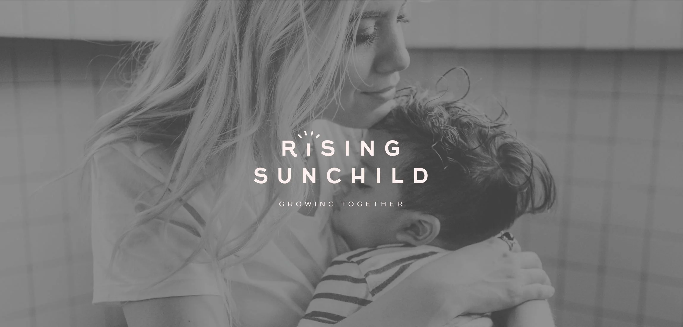
The name Rising Sunchild has deep meaning. This symbolism of the ‘sun child’ and ‘shadow child’ inspired the brand’s visual identity. The wordmark features a subtle sun icon with soft, abstract rays emanating from the top—hinting at waves of emotion, healing and light.
-
-O-
One-of-a-Kind Design
Using imagery from photographer Heather Seed, we pulled colours, fonts and styling from the brand identity so it was seamless. The gentle, nurturing design reflects Penny’s warm approach while encouraging conversions. Every detail, from the typography to the colour palette, was chosen to create an inviting and authentic online experience.
-
-N-
Nurtured Client Experience
Throughout the project, I partnered closely with Penny, offering guidance not just in branding and website design but also in messaging, strategy, SEO and even the day-to-day realities of running a business. My goal was to ensure she felt confident and supported every step of the way and I used my extensive experience running brands to help her.
“I knew the attention to detail would be amazing however I didn't quite realise it would be next level!! Tamsin's knowledge is worth so much to me for my business and attracting the right clients which will be well worth the investment.”
✽
— Penny, Rising Sunchild
✽
“I knew the attention to detail would be amazing however I didn't quite realise it would be next level!! Tamsin's knowledge is worth so much to me for my business and attracting the right clients which will be well worth the investment.” ✽ — Penny, Rising Sunchild ✽
THE TRANSFORMATION & results
Rising Sunchild now reflects the heart of Penny’s work through a brand identity and website that feel light, free and uplifting—perfectly aligned with her personality and the transformational outcomes she offers her clients. With a strong visual identity and a website designed to engage, Penny now has the tools to attract her dream clients—parents seeking empowerment, connection and growth.
The website’s clear structure and strong calls-to-action encourage meaningful engagement, helping Penny build a supportive community while driving bookings. This aligned and intentional brand presence positions her to make a lasting impact in her field with confidence and authenticity.
“I got 3 clients in my first week after going live, I couldn’t believe it!! I have a clear strategy for where I want to take my business and I can’t tell you how excited I am for that. ”
My personal favourite feature.
My favourite feature was the abstract sun icon, which beautifully encapsulates the core message of Rising Sunchild. It adds a layer of meaning to the brand, connecting visually and emotionally with the audience Penny hopes to inspire.

“Usually I get very overwhelmed but Tamsin has such a gift at simplifying everything and focusing on really matters to get you results. She really is the epitome of work smarter not harder.”
Are you ready for a brand identity that finally reflects the high-end services you offer?


